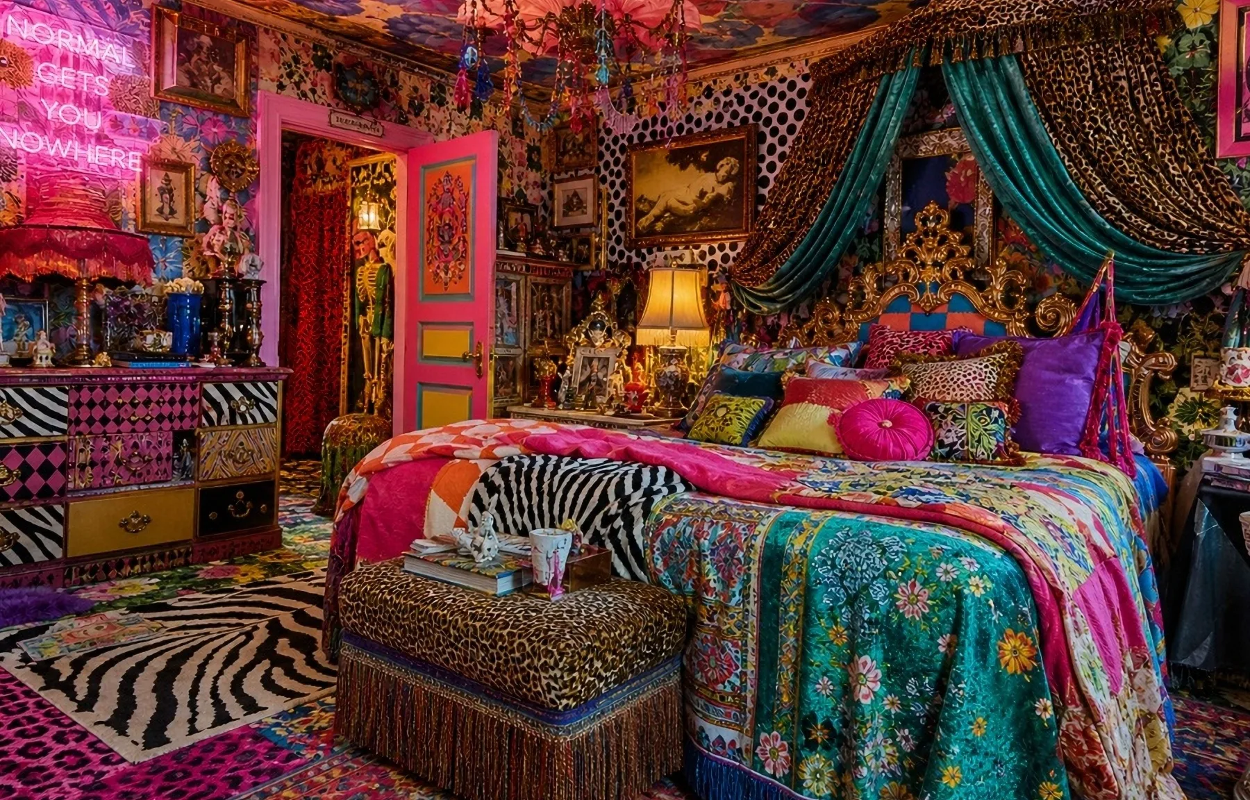
Maximalism is over. Not quietly retired, either. It died the way most design trends die: Instagram killed it by overexposing it until every version looked like a prop from a low-budget music video. The bad news is that minimalism is not the answer either. Rooms stripped of every trace of personality look fine in a show home and miserable to live in. What works is colour used with some conviction and a small amount of restraint.
Colour chaos usually comes from too many competing tones, not too many colours. A room can hold three or four strong colours if they share an undertone. Warm terracotta, burnt orange, and a deep olive sit together without fighting because they are all pulling in the same direction. The mistake most people make is buying things they like individually without asking whether they belong in the same room. A teal sofa and a coral rug are both fine objects. Together they are a headache.
Scale matters more than most decorating advice admits. One deeply saturated colour on a large surface, a wall or a large sofa, reads as confident. The same colour distributed across twelve small accessories reads as anxious. Commit somewhere big and let the rest follow. I repainted my kitchen a near-black forest green eighteen months ago, expecting to hate it within a fortnight. It is now the only room in the flat I actually enjoy eating in.
Texture does a lot of the work that people wrongly assign to more colour. A room in three shades of the same blue will not be boring if those shades are arriving via linen, glazed ceramic, and matte-painted wood. The variation keeps the eye moving without the noise. Layering texture within a limited palette is also considerably cheaper than buying new furniture every time you want a refresh. Decent linen cushion covers run £15 to £40 each. A good throw is £50 to £150. That is a meaningful visual change for under £300.
The paint question always comes up. The premium brands with consistent colour depth in the UK are Farrow & Ball, Little Greene, and Lick. Farrow & Ball gets mocked for its pricing, around £65 for 2.5 litres, but the pigment depth is a step up from mass-market equivalents. Little Greene sits at roughly £55 for the same volume and has a wider historic palette. Lick is cheaper, around £39 to £45 per 2.5 litres, ships fast, and does free sample pots. There is a counterargument from the trade, though. A painter and decorator mate of mine from the rugby club swears by Dulux Trade with the colour matched in their system, and thinks Farrow & Ball paint is shit to use. He is painting walls for a living and I am not, so make of that what you will. Either way, the price difference compounds quickly on large areas, so test before you commit to anything beyond a single accent wall.
What kills a colourful room fastest is overhead lighting. A good colour on the wall in daylight looks flat and slightly wrong under a single ceiling pendant with a cool-white bulb. Warm bulbs, 2700K to 3000K, and lamps at lower levels change the reading of a colour entirely. Sort the lighting before you repaint. It is cheaper than doing both twice.
The goal is not a room that photographs well. It is a room you want to be in at 9pm on a Tuesday with a glass of wine and nowhere to be. Colour does that. Thirty scatter cushions in conflicting prints does not.


